Thursday, January 31, 2008

Complete

I have finished it: the largest LEGO set ever produced (by LEGO - certainly bigger things have been built from LEGOs). And it's amazing.


I actually finished it on Saturday, but this week has been really busy, so I've not gotten a chance to get the photos online until now. But here they are: pictures I took of it right after I put on the last pieces.


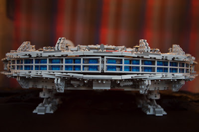
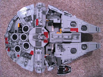
It's astonishingly huge and really very imposing to see in real life. The pictures don't really do it justice (though they are cool): the full effect isn't clear until you actually see it. It's one thing to have an intellectual understanding of how big it is and another to have it spread out in front of you.


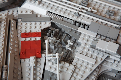
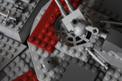
One of the most impressive things about it is that it's built entirely out of "stock" LEGOs - by which I mean that, aside from a couple of printed pieces (the radar dish and a couple of 2x2 round tiles), all of the pieces are found in other sets. The combined effect is no less stunning, and it means that should I ever scrap the thing, I could easily incorporate the pieces into my own creations.


The other really impressive thing is the degree to which the parts of the ship don't come together at right angles. Which, if you've ever played with LEGOs, is by and large the only way the pieces fit together. You can get other angles by skipping studs and using hinges, but for the most part, right angles are all you've got. There are precious few right angles on the Millennium Falcon.


And there's so much detail. You can literally pore over the thing and keep finding detail. Even having put it together (and put all that detail in place) I'm still amazed at the effect produced. Totally worth the time to put all those pieces in place.


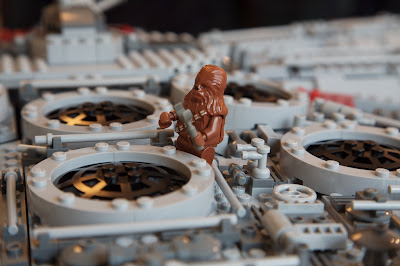
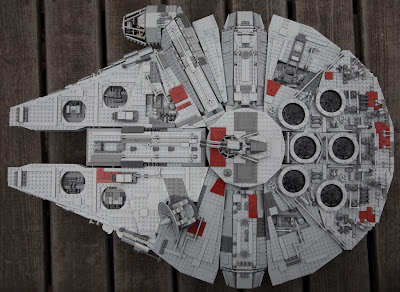
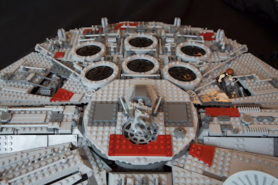
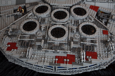
Since Han and Chewie are always working on the Falcon, I took some pictures of them tinkering.


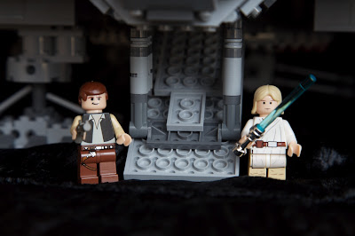
Here's Han and Luke guarding the ramp. Luke still has his father's lightsaber, it would appear.


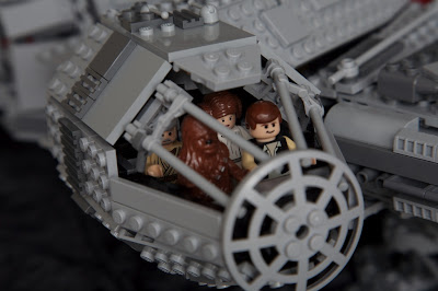
Since the Falcon is built to minifig scale, everyone fits in the cockpit:


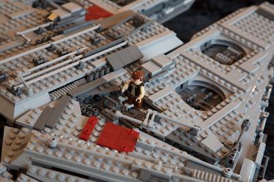
You can even see Luke manning the top quad laser turret:


The only problem I've run into with having such a massive, imposing model is what to do with it. For the moment, I've solved that problem by bringing it in to work. Not sure how long I'll want to keep it here, though: it takes up a lot of space, even if I don't have it sitting on my desk (it's on top of a bookshelf next to my desk). But my coworkers have enjoyed seeing it. And what's the point of a model, if not to share it with other people?

I might see about a glass display case or build a glass-topped coffee table for the den and install the thing under the glass. But that'll be a lot of work (and money) in and of itself. Later, perhaps.

Wednesday, January 23, 2008

Textures

This post actually isn't about me. It's about Tracy. Or, rather, about her photos. Some of my photos I think are pretty original, but Tracy is far better than I at getting (what I consider to be) truly original photos. Perhaps it's because she's not afraid to point the camera at just about anything. Like this picture. Can you guess what it is?

If you said "a horse with a muddy mane" then you're far cooler than I. I like this photo for its texture - that's a recurring theme for the pictures I'm showing here, in fact. It's not entirely sharp, but that's okay, really - it heightens the sense of mystery in what you're looking at.

Here's another one - this one is a little easier:


This is a fence at sunrise with frost on it. I like the way the frost highlights the grain in the wood; the sunrise leaking through the far line of fence is interesting, too.

This one is a little wilder:


It's the rolled lip of a wheelbarrow with frost on it. I like this picture for the depth of field even more than the texture, I think: it's wild the way only a narrow slice of the frost in in focus. What really fascinates me is the way the in-focus parts of the barrow don't line up: the top of the lip is in focus further left than the roll. It makes sense, since that top of the lip is actually further back than the roll, but it's still surprising when you see it.

How about this one:


It's frost on the windshield of the "Mule," a diesel-powered four-wheeler thing with a dump-truck-like bed in the back. You can just make out the word "Mule" through the frost - but only just, because the sunlight striking the frost blew out (saturated the sensor). I like the blown-out frost, though, for some reason.

Given the previous picture, can you place this one:


It's a post supporting the roof of the mule. I like the frost patterns on it - and the subtle play of color as light is scattered at the boundary of frost and air.

Continuing the frost theme:


This is frost on the sill of a window in one of the stalls. For this shot, more than any of these others, I wish she'd had access to a macro lens (I don't have one - it's competing for the "next lens I will buy" spot): the frost is just incredible.

I've often wanted to get a similar picture: sometimes, when there's rain before a frost, you see frozen mud form the most fantastic little structures. Like crystal towers topped with dirt. It's hard to describe and I've never had a camera when I've noticed them. This reminds me of that, for some reason.

Finally:


Frost on the seat of the mule. Again, I really like the depth of field - the narrowness of the in-focus image adds mystery to the whole.

Monday, January 21, 2008

Splat

While we're still not quite set to run a game of "outlaw" paintball (not at an official field) with folks from work, James and I are a lot closer. We still lack a chronograph to check the muzzle velocity of the markers, but we should get that taken care of by the end of this week. And on Saturday, we went over to Jason's deer-hunting patch of 32 acres in Madison and scoped things out. Our consensus was that the games will be awesome.

We brought along our markers to shoot at trees and get a feel for how well they were shooting. That was surprisingly fun, and we blew through a lot of paint (close to 500 rounds, each). It was chilly, so we were fairly bundled; there was still snow on the ground from earlier in the week.

Shooting at trees, James' marker was far more accurate than mine, which was rather depressing. He'd said that the paint he bought was "better," according to the guy who sold it to him, than some of the other stuff at the store - and only moderately more expensive. I borrowed a handful of balls and shot them with my marker - the difference in accuracy was staggering. Clearly it's worth it to buy "better" paint - I could actually hit my mark most of the time with his paint.

Tracy shot some, too - and enjoyed it enough that she's almost convinced she wants to come and play with us.


We might go play as early as this Saturday - hope to post details after it happens.

Sunday, January 20, 2008

Half-Baked

Increasingly, Apple seems to be putting out products that feel incomplete. My previous rant about the MacBook Air serves as an example - a likely forward-thinking idea that's just too early and too unfinished to gain widespread praise. Mac OS X Leopard is another good example. Consider the user interface of Leopard:

This is a composite of screen captures from windows of 3 different Apple-produced applications. The Finder (the background window), Mail (in the upper-right corner), and iTunes. All three applications have a different toolbar (note the extreme difference between Finder and Mail; Finder and iTunes differ mostly in the shape of the toolbar buttons). Mail and iTunes have a different-looking table: note the selected column in iTunes is a matte, bluish color whereas in Mail, it's a transparent, liquid-looking graphite. (Incidentally, though I didn't show it, Finder mimics Mail's table look and feel and not iTunes'.) iTunes and Finder have different scroll bars: the iTunes scroll bar is again a matte bluish whereas in Finder, it's that liquid, transparent graphite again. I could give more examples (like in Finder, you can collapse groups in the sidebar; you can't in iTunes), but you can probably find your own. And it's totally hit or miss as to which look-and-feel you'll get using the machine. Preview share's Mail's toolbar style; Safari shares that of Finder. While in Finder there's a gemstone on the upper-right of the window to hide the toolbar (and the sidebar), in Safari, you have to go through the menus to hide the toolbar.

It's true that Leopard is an improvement over Panther and Tiger - both of which had a dreadful mix of the brushed-metal look and feel and the older, Aqua look and feel developed for the original incarnation of the OS. But still. If Apple was going to clean things up and move back to a unified look and feel, why couldn't they finish the job?

Here's another thing that bugs me. In Tiger (and previously), PPP and VPN connections were handled through a little application called Internet Connect. In Leopard, Internet Connect has been removed and its functions have been integrated into System Preferences' Network preference pane. A good decision (though it took a few minutes to find where they'd moved), since it means that all network connections can be managed from the same place.

But Apple did a half-baked job here, as well. If your VPN connection breaks, or your password is incorrect, the dialog box that is raised shows up with "Internet Connect" in the title and the Internet Connect icon to the left of the error message. Hello? It's almost worse than useless, since it doesn't give the user the correct context to address the problem. The first time I saw it I was completely confused as to why Internet Connect, a no-longer-existent application was raising a dialog box. Then when I read the message, I realized it was merely an example of a lousy job migrating the functionality into System Preferences.

A friend of mine who uses Windows once remarked that you know you've got a really good OS when you start complaining about the UI. I suppose there's something to that. Overall, OS X (Leopard included) is still very solid, very nice piece of software - one to which Windows Vista can't even hold a candle. Nevertheless, I expect more from Apple - namely that they take their time on their releases so they can actually get them right.

Wednesday, January 16, 2008

Miss!

Listen. Hear that? Yeah, that: the whooshing sound. It's the sound of Apple missing. And how appropriate that they named the new machine "MacBook Air."

For $600 more than a MacBook, you can now get a computer with: 1) less processing power, 2) no optical drive (hence no way to install software unless you have another Mac in your house or want to shell out $100 for the external drive), 3) no firewire, one USB, no audio in, and yet-another-different DVI dongle (called micro DVI - mini wasn't small enough), 4) an even slower hard disk than is typically in a laptop - unless you shell out the $999 for the 64GB solid-state disk.

The rationale? It's .4 inches thinner (at its thickest) and 2 lbs lighter. Yay. 'Cause 2 lbs in my bag is actually noticeable.

Don't worry - I've seen all the arguments on both sides. You know, the ones that talk about who the machine is meant for (people who already have a computer and want maximal portability, etc.). I simply reject those arguments. I mean - who cares? Less than half an inch and 2 pounds? For $600? Not to mention the crippled features?

Oh - but it has a multitouch trackpad! Honestly. Who cares? A nice ui touch, but not worth paying for.

The black keyboard is ugly, the bevel surrounding the monitor is still way too fat (similar to the MacBook), the backlit keyboard is a clever gimmick that's been around since the PowerBook 15"....

But here's the biggest miss Apple managed with this machine: no docking station. If you know anyone with an IBM (or even an ultraportable Dell), you've probably seen - and appreciated - the docking station. And Apple left it out - again (or still).

A big miss for Apple at an incomprehensible price.

Saturday, January 12, 2008

Photos of Opportunity

There's a tree up by the airport, an incredibly old and massive oak, that I've wanted to photograph for quite some time. When they did all the recent road construction up there, they were careful to preserve the tree, remarkably enough - for nearly a year, it was surrounded by one of those blaze-orange fences construction crews sometimes put up.

On my way home for Christmas, I decided to head out past the airport. I had the camera in the back of the car, of course, and just as I neared the oak I realized I'd come at precisely the time of day at which I had previously determined the oak would be best lit. It had rained all day, and only just cleared up - it was a perfect opportunity.


So I pulled over and spent a good ten minutes walking around snapping pictures of the tree. Framing it was hard: I wanted to be back away from it, so the viewer would get a good feel for its size, but at the same time, I wanted it to fill the frame as much as possible. And there are towers behind it with racks of lights on them to help pilots line up with the runway during night landings - I could only do some much to cut them out in the framing. Later, I'll see what I can do in Photoshop to clean them up: I really want the tree all by itself.

And then, before I went back to the car, I turned around and saw the fog and clouds framing the mountains.

Thursday, January 10, 2008

In Progress

Lookit: I'm almost done with the Ultimate Collector's Millennium Falcon.


I got this thing back in November (it's one of the limited first edition, that comes numbered - I was tempted to buy two and save one new-in-the-box in my attic to resell in 5 years (likely for 100% profit) but couldn't justify the up-front cost). I've not worked on it compulsively, and happily, I still have building left to do (as you can see).

It's massive - over three feet long and about two feet wide. I've not weighed it, but I expect it's around 10 pounds. There's over 5000 pieces - true, many of them are small, but still.... There's a lot of plastic there - and a lot of detail. I didn't take the time to get lots of detail shots (those will come later, when I'm finished), but I assure you that there's a lot of detail. It's great.

The only problem is that I have no idea what I'll do with it when I'm done building it. It's really too big to just have sitting around, and besides.... I'm not one to display model-type things. I'd be tempted to take it to work and display it there (at least people would see it) but it's just too big. I mean, it'd eat up about half of my desk!

I've also been working on getting my paintball marker (a second-hand Spyder Compact 2000) ready for an outlaw game we've been trying to get together with some guys at work (waiting on a cronograph, so we don't end up shooting with dangerous velocities). It's missing an O-ring (should be one on the dark-gray piece below the bolt), so it's still in pieces; still trying to find the O-ring so I can finish oiling it and put it back together.

Reblogging

I find New Year's resolutions to be silly: if you want to change something about yourself, why wait until the new year? Weren't you overweight last year? Lazy last year? Mean to your children/spouse/etc. last year? So why didn't you change then? Why does the idea of it being a New Year make change seem so much important - or so much more attainable?

So this is not a New Year's resolution: I intend to pay a bit more attention to my blog. As in, actually update it from time to time, rather than only once every several months. Shortly, as in, next week, I hope to have a new laptop - that might help a bit ('cause more of the stuff I care about will be centralized in one place, making things like posting pictures so I can blog about them easier). As poor I am at planning ahead (e.g. putting up pictures ahead of time so I can blog about them), that little change should make a difference.

We'll see. At any rate, I'm not making promises. I just realized yesterday that I rather miss blogging: it's nice to be able to look at something I've written, and to have pictures I've picked out somewhere I can point to.

A post with content follows.