Wednesday, October 8, 2008

Presidential-Campaign Lying: Inexcusable

Last night, the second of the three Presidential Debates for 2008 aired. Like the first debate, there were no fireworks, no home runs, and no real difference was made in the campaign. I only recall one truly excellent answer (given by McCain on whether or not Russia would once again be an "Evil Empire"); there was much prevarication and demagoguery.

There was also a lot of lying. Several times during the night, one candidate would say, "John McCain's/Barack Obama's plan for health care/taxes/etc. does X, while my plan does Y." To which the other candidate would say, "Barack Obama's/John McCain's plan for health care/taxes/etc. does U while my plan does W." Clearly, one of them was not telling the truth or was distorting it. Most likely, both of them were, basically, lying.

This is inexcusable. For a whole host of reasons. In our day-to-day dealings with people, we demand, even if we don't always expect, honesty. We demand it of our children, we demand it of our friends, we demand it of our spouses. Honesty is prized. Why, then, do we tolerate it from our politicians? I hear people say all the time that they cannot/do not trust politicians. Political untruths have become a given and, even worse, are viewed as acceptable. Shown a bald-faced lie by one candidate or another, people merely shrug, rather than express indignation.

In past decades, politicians could get away with lying on the campaign trail and lying to audiences in televised, national debates. There was no effective way to fact check candidates' statements as they were being uttered and, even if it was known that a bald-faced lie had been uttered, no effective way to push that information out to the masses.

Today, televised lying should be impossible. With the Internet at our fingertips and the vast pool of knowledge shared by bloggers and the main-stream media, any falsehood uttered by a candidate should be immediately flagged and highlighted; posted in prominent places for all to see. It is truly ridiculous that the majority of Americans simply don't know when they've just been fed a lie.

Here's what I envision. In the next Presidential election, at every event a candidate attends, groups dedicated to fact checking political statements (like FactCheck.org) show up with fast Internet connections and massive screens and, in real-time, fact check the candidate's (or candidates') statements.

Imagine, in a debate format: John McCain claims that his idea to write down mortgages with government money is a new idea, all his own and, immediately, over his head, appears the fact check:

McCain proposed to write down the amount owed by over-mortgaged homeowners and claimed the idea as his own: “It’s my proposal, it's not Sen. Obama's proposal, it's not President Bush's proposal.” But the idea isn’t new. Obama had endorsed something similar two weeks earlier, and authority for the treasury secretary to grant such relief was included in the recently passed $700 billion financial rescue package.
(source: FactCheck.org)


Likewise, Barack Obama states that his health-care plan would lower premiums and, immediately, over his head, appears the fact check:

Obama said his health care plan would lower insurance premiums by up to $2,500 a year. Experts we’ve consulted see little evidence such savings would materialize.
(source: FactCheck.org)


It wouldn't take long for candidates to figure out that lying in such a context is absolutely useless and only serves to clearly paint them, in the eyes of the public, as the mockery of statesmanship they have already become.

Let's face it. In 2008, with the amount of information we have at our fingertips, that candidates can mislead voters through misrepresentation, mangled facts, and outright lies is simply inexcusable. It's about time someone threw this kind of nonsense under the bus.

Wednesday, September 17, 2008

TIME for Progress?

Sometimes progress is bad. Take, for instance, the redesign of TIME's website Time.com.

Time.com is where I typically go for my news. They're less sensational than I found CNN to be and their articles are of a significantly higher caliber, since the writers produce simultaneously for print and web media. Unlike CNN, the articles are not updated throughout the day, so you don't get nonsensical duplicated sentences nor references to some official whose name is never situated (with a profession or a locale or anything) because that sentence was clipped on an update. The articles hold together and feel professional.

What I liked about the old Time.com was that you could quickly scan the homepage and see what was new - and thus quickly make decisions about what was worth reading. The slideshow of 5 featured articles was great. I could watch that and have a good idea what was what without even drilling down and reading the articles. The list of "new" stuff to the right of the slideshow was similarly accessible.

All that changed on Monday. The slideshow is gone, and the 5 featured articles are now 3 - only the first of which gets a picture. The "new" stuff section ("Latest Headlines") is smaller and no longer indicates when an article comes from the Associated Press rather than TIME's staff (AP writers don't have a clue what to do with English grammar, so I often eschew reading their reports). The layout is borderline garish. Design things to gripe about:
  • In the first screenful of the site there are:
    • 7 different font sizes;
    • 2 different font colors;
    • 2 different font faces; and
    • 4 different font weights (counting italic as a weight, which is technically incorrect).

  • There are 5 different sizes of photos - these appear in all columns.

  • The three columns are the same width, but you wouldn't know it to look at them because the elements they contain vary in size so much.

  • Each chunk in each column is of a height unrelated to those in the adjacent columns. There's never a place you can draw a line all the way across the page and feel like you've moved into a new section. Hence it looks like a disorganized mess.

  • There's even a chunk that spans two columns, seemingly without any good reason. (That's the "New in Brief" chunk.) That forces a huge mess of white space below the featured article chunk. Ugly.
This is all with an ad blocker running, I should say - I can't imagine how bad it must look if you can actually see the ads.

Why do I mention all of this? Because the cacophony, which looks like something a kindergartner would produce, makes it nearly impossible to scan the page to see what's new and worth reading. I see it and my immediate reaction is "yuck!" I want to navigate away from the page. Kind of like I walk into Hecht's and want to run back out the door. Too much visual clutter. The old design may have looked - well - old, but at least it conveyed information in a way that was clear and concise and without excessive visual clutter.

Here's an opinion that matches mine, from a design professional. Here is one that disagrees (from another design professional). Obviously, some of this is subjective. But the fact that I thought for a moment that the CSS didn't load when I opened the page for the first time on Monday (because it looked so disorganized) should clue someone in that something is wrong with the site.

"Proof" that the new design makes me miss things: until I saw Austin Ramzy's blog post this morning about the milk scandal in China, I never knew that he'd posted an article on the same yesterday. That's kind of important to have been lost in the clutter on a redesigned website.

I wish they'd asked for feedback, first.

[Update] Two and a half weeks after the redesign of the front page and the main article pages, the new design still hasn't been pushed out to all of the sections of the site. Just click on the Elections section and see how it differs! Ridiculous.

Friday, September 5, 2008

The Alien Frigate


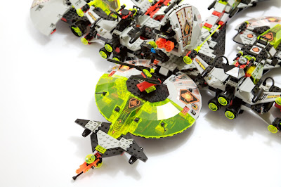
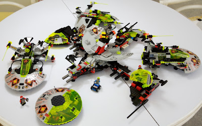
I finished modeling the Alien Frigate (the aforementioned big ship in my basement) and decided that it would be easer and better to just take pictures of the thing rather than try to organize all of the sections of it so I could get good renderings. So here it is, as a bunch of photographs rather than renderings.


The first picture shows the frigate "assembled," that is, as a ship, with all of its sections attached. It's huge, heavy, but surprisingly rigid. It has over 1300 pieces and is 26" by 29" by 6.6". It requires two hands to hold comfortably, but is nevertheless swooshable. You don't, however, get the feeling that it would be particularly nimble in a fight, so I included a couple of turreted guns (immediately above) to help fend off smaller ships. Woe to any foe who crosses in front of it - this thing is armed to the teeth.


Once landed, the frigate breaks down into the central structure plus four smaller ships: the half-saucers that flank the rear turrets assemble into a classic "flying saucer;" the drone, shown in an early post, is a combination of the port gun pod and the wing pods; the last two ships are LEGO's Warp-Wing Fighters which I modified so that the rear detaches. The pod/array on top of the central section opens to reveal another turret, a communications array, and a seat for an operator.


The flying saucer itself contains two guys and a little car, making it perfect for exploration. It's surprisingly fun to fly the thing around and even more fun to pull it apart, open it up, and transform each half of it into a little base. Because the tops open completely, it's easy to get to and put stuff inside the saucer.


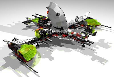
Here's the rendering I did from the finished model. This is just the central section of the frigate (without all of the other sections attached). I like the color selection better on the rendering - not being constrained by what's in my collection and being able to think over the colors more carefully, I biased the overall scheme more towards gray. Seems more in keeping with the UFO theme.