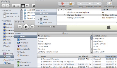
This is a composite of screen captures from windows of 3 different Apple-produced applications. The Finder (the background window), Mail (in the upper-right corner), and iTunes. All three applications have a different toolbar (note the extreme difference between Finder and Mail; Finder and iTunes differ mostly in the shape of the toolbar buttons). Mail and iTunes have a different-looking table: note the selected column in iTunes is a matte, bluish color whereas in Mail, it's a transparent, liquid-looking graphite. (Incidentally, though I didn't show it, Finder mimics Mail's table look and feel and not iTunes'.) iTunes and Finder have different scroll bars: the iTunes scroll bar is again a matte bluish whereas in Finder, it's that liquid, transparent graphite again. I could give more examples (like in Finder, you can collapse groups in the sidebar; you can't in iTunes), but you can probably find your own. And it's totally hit or miss as to which look-and-feel you'll get using the machine. Preview share's Mail's toolbar style; Safari shares that of Finder. While in Finder there's a gemstone on the upper-right of the window to hide the toolbar (and the sidebar), in Safari, you have to go through the menus to hide the toolbar.
It's true that Leopard is an improvement over Panther and Tiger - both of which had a dreadful mix of the brushed-metal look and feel and the older, Aqua look and feel developed for the original incarnation of the OS. But still. If Apple was going to clean things up and move back to a unified look and feel, why couldn't they finish the job?
Here's another thing that bugs me. In Tiger (and previously), PPP and VPN connections were handled through a little application called Internet Connect. In Leopard, Internet Connect has been removed and its functions have been integrated into System Preferences' Network preference pane. A good decision (though it took a few minutes to find where they'd moved), since it means that all network connections can be managed from the same place.
But Apple did a half-baked job here, as well. If your VPN connection breaks, or your password is incorrect, the dialog box that is raised shows up with "Internet Connect" in the title and the Internet Connect icon to the left of the error message. Hello? It's almost worse than useless, since it doesn't give the user the correct context to address the problem. The first time I saw it I was completely confused as to why Internet Connect, a no-longer-existent application was raising a dialog box. Then when I read the message, I realized it was merely an example of a lousy job migrating the functionality into System Preferences.
A friend of mine who uses Windows once remarked that you know you've got a really good OS when you start complaining about the UI. I suppose there's something to that. Overall, OS X (Leopard included) is still very solid, very nice piece of software - one to which Windows Vista can't even hold a candle. Nevertheless, I expect more from Apple - namely that they take their time on their releases so they can actually get them right.

No comments:
Post a Comment